Brand Film
SHOUT Studio Sizzle Reel
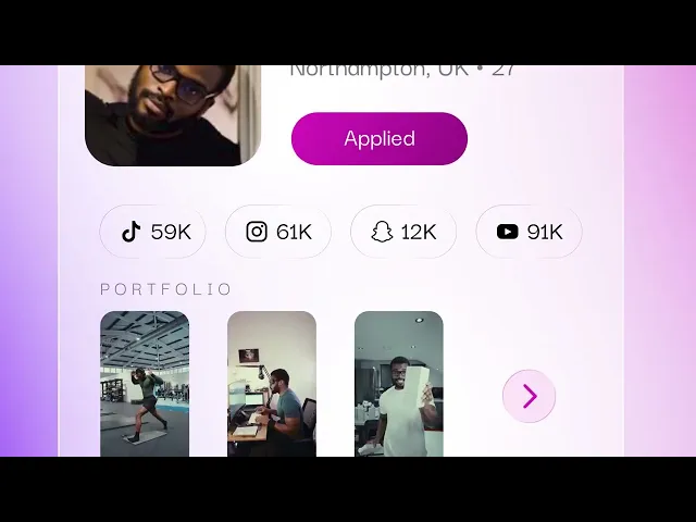
A fully animated sizzle reel marking SHOUT's platform rebrand - built on abstract shape and typography rather than literal UI, our most stylised piece to date.
Year
2026
Industry
Creator Marketing
Client
SHOUT
Project Overview:
When SHOUT relaunched their platform with a full rebrand, we built the sizzle reel to introduce it - a piece designed to sell the feeling of the new brand rather than walk through specific features.
Rather than the UI-rebuild approach used across most of our SHOUT work, this piece leans fully into abstract motion - typography, gradient, and shape-driven animation carrying the brand's new visual identity. It's the most stylised, least literal piece on the site, built to show range beyond feature-led UI work.
Brand Film
SHOUT Studio Sizzle Reel
A fully animated sizzle reel marking SHOUT's platform rebrand - built on abstract shape and typography rather than literal UI, our most stylised piece to date.
Year
2026
Industry
Creator Marketing
Client
SHOUT
Project Overview:
When SHOUT relaunched their platform with a full rebrand, we built the sizzle reel to introduce it - a piece designed to sell the feeling of the new brand rather than walk through specific features.
Rather than the UI-rebuild approach used across most of our SHOUT work, this piece leans fully into abstract motion - typography, gradient, and shape-driven animation carrying the brand's new visual identity. It's the most stylised, least literal piece on the site, built to show range beyond feature-led UI work.
Brand Film
SHOUT Studio Sizzle Reel
A fully animated sizzle reel marking SHOUT's platform rebrand - built on abstract shape and typography rather than literal UI, our most stylised piece to date.
Year
2026
Industry
Creator Marketing
Client
SHOUT
Project Overview:
When SHOUT relaunched their platform with a full rebrand, we built the sizzle reel to introduce it - a piece designed to sell the feeling of the new brand rather than walk through specific features.
Rather than the UI-rebuild approach used across most of our SHOUT work, this piece leans fully into abstract motion - typography, gradient, and shape-driven animation carrying the brand's new visual identity. It's the most stylised, least literal piece on the site, built to show range beyond feature-led UI work.